Tuesday, 13 December 2011
Sunday, 11 December 2011
1. In what ways does your media product use, develop or challenge forms and conventions of real media products?
Our music video also broke away from the typical conventions of a lot of music videos, we used a original idea of Ruksana being in a shadow while Raees was in the light singing to the camera, the shadow effect showed Ruksana's silhouette making it obvious that Raees was still the main focus of the video and we are promoting his image and showing that he dreams of Ruksana.

We also created a original element by having Ruksana singing at one point to the male singing part, this demonstrates the idea that they are both connected and in love. Amy Winehouse's music video 'valerie' is similar as people who are not Amy Winehouse lip-sync her song. Even though, Amy Winehouse is not the same genre of our own music video, we still liked this feature and adapted it to our music video. However, I believe our music video is original by making Ruksana lip-sync to Raees part.
We decided to create a illustrative music video, our video features a mixture of performance and also narrative. We believed a illustrative music video most related and conveyed the typical conventions of a RnB music video. The narrative features a boy and girl who are both in love, the boy sings to the girl and flatters her relating to the lyrics 'you can be my it girl'. This love story narrative is similar to other videos like 'Just the way way you are' by Bruno Mars and 'Everybody in love' by JLS.
We used Goodwin's theory to compare the conventions of our music video.
- Music video demonstrate genre characteristics. I believe our music video does demonstrate the characteristics of our music genre, RnB. In our music video, we feature a couple in love and as shown in the Bruno Mars and JLS videos above, they also feature a love story narrative and also are in the RnB music category.
- There is a relationship between lyrics and visuals. In our music video, there is a relationship between the lyrics and visuals, the boy praises the girl saying 'you can be my it girl', the lyrics of the song are even shown in a text message. The happy nature of the actors reflects on them being in love and relates to the lyrics of the song.
- There is a relationship between the music and visuals. There is a relationship between the music and visuals in our video, the camera cuts to the music and the fading of the sunshine between the couple is an effect which relates to the music.
- The demands of the record label will include the need for lots of close-ups of the artist so that the artist may develop motifs. In our music video we do include lots of close-ups of the male lead singer, Raees, we did this knowing it would be the demands of a record label. I also believe the close ups of his 'it girl' promote the image that he is a caring man appealing to a female audience.
- There is frequent reference to the notion of looking and particulary the voyeuristic treatment of women's bodies. We do not feature the notion of looking in our music video, however we do contain the slight voyeuristic treatment of a woman's body. The female actor in our music video, Ruksana, we show her silhouette we can be interpreted sexually.
- There are often intextually references to films, TV, programmes other music videos etc. We decided not to use any references to other forms of media and made our video completely original.
Overall our media product does use, develop and challenge forms and conventions of real media products. We do follow the typical conventions of a Rnb music videos, however we also challenge these forms by having the female lip-sync the male role at one point and add in original elements with the editing.
Thursday, 8 December 2011
2. How effective is the combination of your main product and ancillary texts
From watching the video we can also see that Raees (Jason Derulo) looks very happy being with his perfect girl, he looks very proud and confident, this is portrayed in many ways the main one being the way he can stand tall and sing the song to her, as the song itself is a huge important part of the video we tried to still portray this image within the magazine advert. We decided to postion him and take a photo where you can see the full length of his body, we is also slightly smiling but not too much as we didnt want to give anything way, he also looks very confident like in the video. The way he grabs hold of the microphone and looks us directly in th eye shows that he is very serious about telling us about his "It girl" which he does and perfoms in a great way within the video. We have purposely not given anything away with the advert and we want people to be drawn to it by the eyecatching colours and to listen to the song, if we put a lot more things on the advert then we thought it would be giving too much away, we thought that we would sell our product better this way as people would want to know and find out more and buy the song.

We also portrayed a similar style through our digipack. For the cd cover we included a close up photograph of Raees (Jason Derulo) in which he is looking to the side. This still has the similar plain style and the same use of colour with the "love" red rouge writing which says "GIRL" we have made this really big on purpose as we want people to remember the name so they will buy it. We decided to include a close up photograph of him for two reasons, the first one being as it is only his face and he is looking away, this way nobody would be able to know what the song is about which will lead to them buying it to find out. Secondly Jason is also quite a modern new artist and isn't as well known as some of the artists in the music industry. We wanted this close up image of the face so that people can see and remember who he is, to get his confident image out to show that people should look out for him, as a piece we were all happy with the way it has been created, also with the simple but effectivness. This same theme runs through the digipack which links in with the video and advert which we thought is crucial as it basically comes in one piece, with the song.

We thought that also be rearch that we could use marketing strategies for this by putting it on a website which we have wrote on the bottom right corner of the advert, which although is out the way from the picture, it is still quite big and easy to spot. People would log on to this website where they can find more information about Jason himself and might become very interested in him and his style of music.
We thought it was important to put it into music magazines of an r&b style as it is a typical r&b song which those who like this style of music will love, we also thought that we could widen this as although the advert itself has a boy on the front, the colours are very appealing to both men and women and women themselves might see him as a sort of "eyecandy" as we know that image can also be a big part of selling a product, we thought that we could market this product by putting it into both male and female magazines so a whole range of ages, male or female get the opportunity to see it.
 "Q magazine, a music magazine which appeals to people will different styles of music.
Overall We think that the combination of our main product and our ancillary texts work really well together and have be well thought out and produced to be eyecatching and appealing to all.
3. What have you learned from your audience feedback?
After finishing the Jason Derulo 'It girl' music video, we decided that it would be appropriate to gain audience feedback from our video. We initially very much hoped that we would be able to get a audience feedback from publishing our video onto Youtube, however because of copyright issues we were unable to do this. Immediately we decided that we would conduct a questionnaire and find out the respones of other people. You can find the answers from the questionnaire on the blog post 'questionnaires and feedback'. The questions we asked were:
Are you male or female? - this was to see whether opinions differed with gender.
Name you favourite thing about the music video.. - this showed us the strong points about the music video.
How was the music video appealing to you? - this allowed us to know what each individual particularly liked about the music video.
How could the music video have been improved? - this informed us of our weaknesses in the music video.
What is your opinion of the camera work? - this allowed us to gain the opinion of the camera work, the part all of the group worked on.
What did you think of the locations used? - this informed us of the audiences opinion of the locations we used in the video.
What did you think of the performance of the actors in relation to the song? - this told us whether we picked the right actors and how the audience thought they performed.
Out of a scale of 1 to 10 , how would you rate the music video? - this allowed us to know how much the audience enjoyed the music video.
We found the results of the questionnaire that out of the people we interviewed, they all appeared to agree that we should of included more locations in our music video, we know this is an area of our music video that we could of improved on and now know if we were to create another music video, we would include a lot more locations in our video. From the results we gained, we also found that the biggest positive about our music video was the performance in relation to the song, all the people we interviewed agreed that the actors for our video were very believable and played the role excellently. Also, we found from the results gained from that questionnaire, that females appeared to rate the music video a lot higher, this suggests to us that the love story narrative of the video is more appealing to a female audience.
4. How did you use media techologies in the construction, research, planning and evaluation stages?
 To research, plan and evaluate our music video we used Apple Mac's through all the stages.
 To research, our music genre we used Youtube.com. Youtube is a free online video sharing site, so this made it easier for us view other people's and artists videos and songs to see whether we wanted to use them.
 We used Blogspot.com to create our blogs for our music video. Blogpost is a free blogger site where uses can create and share blogs easily.

The Green screen gave the illusion that characters in the video were at different locations; this was helpful in the planning process as it let us think 'out of the box' and not have to limit our video to simple ideas.
 To edit our music video we used Final Cut Pro 7. Final Cut Pro is a non-linear video editing software developed by Macromedia Inc.
  To produce our ancillery tasks we used a Nikon coolpix compact digital camera. The camera was high high quality so let us plan better products like the digipack and poster because we knew that we would have high quality equipment.
 We used Photoshop to create our ancillery tasks. Photoshop is a graphics editing program that let us add graphics and effects. Photoshop let us plan great produces and research different effects we could add to our products. For example, we researched some vintage Photoshop actions we could add to our poster and successfully applied them.
 We used Facebook to promote our video and get audience feeback quickly. Facebook is a popular social networking site so it accessible and easy to get information you require.
Facebook was also an advantage in the evaluation stage because we could use the feedback to add in our evaluation of our product.
Final Cut Pro
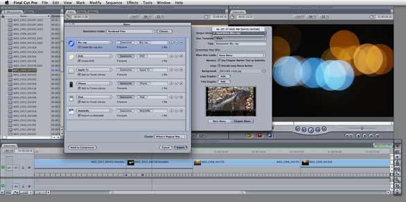 To edit our music video we used Final Cut Pro 7. Final Cut Pro is a non-linear video editing software developed by Macromedia Inc. and then Apple Inc. Clips can be edited together in timelines called sequences. Sequences can be nested inside other sequences, so that a filter or transition can be applied to the grouped clips.
We edited out film and used different cuts, transitions and effects to create our film. For example, we used a fade transition on some shots to add effect rather than just a simple shot. We also used a fade to black transition while we were in the studio and then added it to Final cut pro.
Wednesday, 7 December 2011
Photoshop CS5

To edit our CD digipack and magazine advert, we used Photoshop CS5. Photoshop CS5 is a graphics editing program developed and published by Adobe Systems Incorparated. This program was very helpful when editing, we were then able to crop pictures, change the contrast and brightness, add a large variety of fonts and also able to add on many effects. We hope that with the help of Photoshop CS5 that we were able to produce a professional and sophisticated CD digipack and magazine advert.
Questionnaires and feedback


We found from the following results that out of the people we interviewed, they all appeared to agree that we should of included more locations in our music video, we know this is an area of our music video that we could of improved on and now know if we were to create another music, we would include a lot more locations. We also found from the results gained from that questionnaire, that females appeared to rate the music video a lot higher, this suggests to us that the love story narrative of the video is more appealing to a female audience.
Copyright issues

Tuesday, 6 December 2011

Comparing our digipack


For our front cover we decided to go with a close-up of our main character, like in Ed Sheeran's cover for his debut album '+'. We decided this is the best idea as the close-up suggests the album is going to contain good music but the artist is also important, but not a suggesting or sexual pose which could suggest the album is only about the artists image.


For our back cover we wanted to create a simple design (like the front cover) to suggest the music is important in the album. We used a similar design to Adele's album '21' when listing our tracks. We did this because we liked the design and even though there is an image of the artist the tracks are a main feature and stand out in the design.


For the inside left of our digipack we wanted to create a booklet, similar to Beyonce's on her album '4'. Her booklet is a book of song titles and a '4' photo-shoot. So we took some photos of our actor and decided this was the best one to go on the front of the booklet, to create an extra feature to the album, like Beyonce.


We decided we wanted our disk to have a simple design and not have it too complicated. We looked through some of our CD albums of our own and found The Saturdays 'On your radar' album. They used a simple colour which reflected their album design so we tried to use a similar design for our own album.
Creating our digipack: Fonts


We then looked around the web to find some fonts to download and test our album title. Using photoshop we come up with some versions of our titles.

We decided to use the font 'ClementePDaa' it's the third font in the list. We used this font because we thought it font represent our genre best. We found a similar font on Adele's album 21. We looked round the web and found other similar fonts used in the pop music industry, so decided this would be appropriate for our album cover.
Creating our digipack: Colours


We thought the black and white effect made the album cover look interesting because of the lack of colour can give emphasis on music rather than artist image. We decided to go with black and white for our cover. However we added a purple colour to the title on the cover, similar to Adele's album 21 where the '21' is highlighted green.
Ways of advertising songs/albums
Other ways of promoting songs and albums:
- Magazine and newspaper advertisements
- Internet e.g. youtube, itunes, social networking sites, pop ups
- Billboards
- Concerts
- Magazine and newspaper reviews.
- Advertisements in shops such as HMV
- CD signings and special events
Photos we didnt use

We took this photograph as Ruksana who is the girl in the video and was going to include it on part of the inside cover for the album. After taking the picture we decided not to use it as we thought the quality didn't look as good. We thought that the frame of the picture was took really badly and we didnt like the shadow which is easily seen in the background and editing it out would look quite fake. We also thought that we should just include Jason Derulo on our digpak as he is the main person who the song is about, she just starrs as his girlfriend in the video.

We took this photograph of a heart which we created by changing the lighting in the studio and creating shapes with Ruksana's hands. We decided that when looking back at the photo that we wasn't going to use it as it looks quite blurry and unprofessional. We also thought that it looked quite close up and it would have looked much better if it was taken further away.
 We thought that the position of this picture of Raees would would like a really good idea for the postion for our cd cover. We did not like this picture however as we couldn't get the lighting perfect and there is a shadow over his body which has been caused by the lighting and also the microphone. We decided to have a play around with the lighting to try to get our perfect picture.
 I quite liked this photograph of Ruksana and Raees as I think the position looks really good. We decided not to use it as again we thought that we should not use Ruksanna to be on the album cover or poster. I also thought that the expressions on their faces were too different, and as they are meant to be showing this happy couple madly in love but on this photograph they are quite far away from each other and Ruksana's expressions on her face look quite moody.
We thought as a group that we would decide to create a close up Raees's face as Jason Derulo for the album cover. Once we had chosen our idea we tried to get a perfect picture by playing around with the camera. I quite like this photograph but the shadow and lighting ruined it. You can only see one side of his face as the other side is covered by a shadow. This ruins the phone image completely as it doesn't look as professional and doesn't stand out.

We thought that this photograph of Raees was positioned really well on the camera. After we took the photo and looked back at it we decided we didnt like the expression on his face. We thought he looked quite sly and looked like quite a forced smile. We thought that this wouldnt be good for a cd cover as people going to by this cd might also notice this, and on the video and the song we are not trying to portray in anyway that he is being sly.

This photograph of Raees we thought was quite a good image to use maybe for the inside of the cover. When we uploaded it onto the computer we thought that the quality looked quite poor and the photo didnt look good if we stretched it it so we decided not to use it. We also thought that the images in the background spoilt it as you can tell that it has been took in someones house and we didnt want it to look like that.

We also took a photograph when we was filming of Ruksana and Raees creating a heart by using the lighting, they created a shadow with there hands. After uploading the image we thought it looked really good but instead of using it on the inside cover, we decided to use the clip that we took on the music video as we thought that it would look more effective.

We also had an idea for the inside cover of putting lots of home images together to make it look like it has been took with a polaroid. Ruksana sent me this image from her phone which I think is really good as they look happy together, but we decided not to use it. As we are advertising Jason Derulo's album and not just the one single "It Girl" It would be quite stupid to use these because Ruksana is only part of one song, and not them all and Raees is the main person.