
Showing posts with label Poster. Show all posts
Showing posts with label Poster. Show all posts
Tuesday, 6 December 2011

Wednesday, 19 October 2011
Magazine Advert - Katy Perry - Teenage Dream
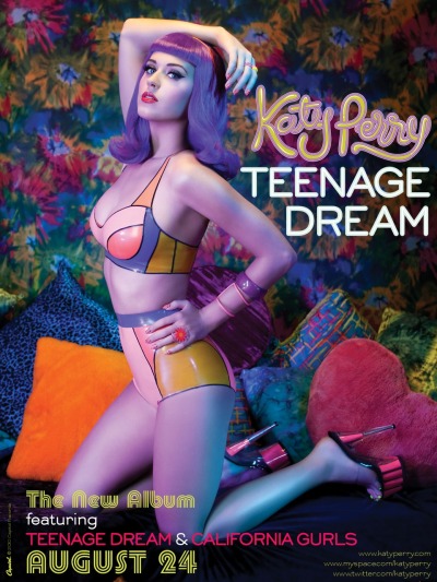
Katy Perry is a popular American singer, songwriter and actress who hasn't been in the music industry very long but is well known and liked by many. "Teenage Dream" is her second album which included a few UK number one singles. I have chosen this poster to analyse as ideas as I think it is quite unusual.
I am immediately drawn to the poster due to the use of the colours. They are very bright and bold, and are also very eyecatching. They indicate lots of emotions as they contrast and look very unusual. The way she has used produced them have been in a very creative way, almost sureal hence the title "Teenage Dream", in your dreams you can make anything possible. Katy is stood in a very sexual position and she wearing very little clothing which looked very retro themed with the use of neon oranges yellow and blues together. The way she is stood with her hand on her hip and her arm in the air shows that she is a confident person and she is showing of her curves and body. As the album is called "Teenage dream" she is immediately appealing to teenage girls and girls will see her as a unique icon and would want this perfect figure, and also idolise her as a role model which they can be like.
Katy is also wearing very vibrant red lipstick which symbolises what a typical female would wear however the way the poster has been created and also thought out with the blue wig she is wearing indicates her individul style which could reflect her style of music which again would make people want to purchase the album and listen to her songs. From looking at the photograph I think she is in a bedroom on a bed full of cushions and the wall paper is again very retro. The oranges and yellows indicate happiness and the sun where as the colour blue indicates calmess and a relaxed feel. She also has a pink heart cushion which is a typical female related colour. She is basically saying if you dream anything can come true almost as if she has been dreaming all her life to be the person she can now be and be accepted.
The writing on the right hand side which says "Katy Perry, Teenage dream" is quite big and spread out so that you can read it very clearly. She has also got links to her website which I think are very good because although they are small in the right corner people will see them and have a look at her website and get to know more about Katy and her music. I think that putting the website link would be a really good idea for our magazine advert. At the bottom of the page it says when the album id being released, this is in a very retro thought which again links in with the theme. Overall I like Katy's style of magazine advert as she has used her very own creative input and has made it very appealing and unique for her style.
Tuesday, 18 October 2011
Magazine Advert - Jessie J - Who you are

Jessie J is a British artist/songwriter who has a typical style of r&b. She has not been in the limelight very long and is still a very new face to the music industry. Jessie J's album "Who you are" was released in February 2011 and charted at number two on the UK Albums Chart.
I found this advert for her album in a fashion magazine for women. First impressions of the advert I can see that there is little colour but yet the black which has been used is still very eyecatching. As we know that Jessie is a very new artist we know that she wants to get her image out too get the public to like her. The photograph is a very close up photograph of her face and we can only see up to her shoulders. She dominates the whole page as it is very clear and close up. The colours which have been used on the whole advert are monocrome, black and white. The advert is quite simple but well thought out.
Jessie looks very mean and aggressive and doesn't really look approachable, not the typical image of a female. The writing at the bottom of the advert advertising her songs are black on white which makes them stand out very boldly, they are also in capital letters which shows the high importance to reading them. As we can see, one of her songs are called "nobodys perfect", well by looking at her we get a totally different image for the way she is presented, her hair looks very neat and perfect as well as her black lipstick which has been neatly painted on. Also the song "Do it like a dude" links in with the way she looks, very angry, fiesty and quite boyish.
The colour black has also been used but can also make you question about what more she has to offer and what she is really like. It can also indicate class and sufistication however, it can also symbolise death and a gothic image. Jessie herself is not giving nothing away as she is leaving people to question her emotions and think about her true colours, what she is really like. The writing "Jessie J" covers most of the page which shows that she is trying to make people aware that that is her name, and people should remember it.
Although it is quite a simple advert I think it works really well at portraying this myserious image of her true character.
Poster Ed Sheeran

Ed Sheeran is a recent artist who has just came into the music industry. His album '+' is a highly antcipatied album becoming number one. One of the ways used to promote his album is through posters. I frequently purchase the music magazine Q, a highly respected music magazine and this is where I found this poster.
The poster features a picture of the artist Ed Sheeran with a close up of his face. The artist is looking down smiling which reflects on his personality. The smile suggests to me that he is proud of the success of the album. The colour of the poster has a reddish brownish hue highlighting the ginger hair of the artist, what he is most commonly reconginised for.
There is little writing on the poster which demonstrates the simple nature of Ed Sheerans music, it informs the reader of some of the songs which are included 'A team' and 'Lego House' which are big hits, this might make the audience want to buy the album more. There is also a quote, 'what really sets Sheeran apart is his skill at painting pictures with posters', this gives a positive input to the artist and suggests that his music is as beautiful as a painting. The positive review of the album is also reinforced by the four stars at the bottom of the poster suggesting it is very good.
Overall, I think this is a very effective poster and we will use similar ideas in our own album poster.
Monday, 17 October 2011
Magazine Advert: 'Lady Gaga - Born this way'
 Born this way is Lady Gaga's latest album released in summer 2011. It was highly anticipated so the 'haus of Gaga' (her production team) had to think of ideas to promote the album. One of the most effective ways they promoted the album was though promotional posters. The one shown was the one mainly used to promote Born this way.
It features a close up of Lady Gaga (the artist) that fills the whole poster. There is a red sketchy title that says 'GAGA' which indicated the artist. As the album was so highly anticipated there wasn't any need for a name because everyone knew about the album.
The poster also uses religious connotations to indicate the release date of the album. This suggests her music is also going to reflect a religious nature too.
I don't think we can just use the artists name on our poster because the album isn't as well know as Born this way. However, some features used like the large scale image and reflecting the music style in the image of the poster could be used on our poster.
Sunday, 16 October 2011
Magazine Advert - N Dubz- Greatest Hits

N-Dubz are are British hip hop group which are from Camden in London. They include three different people, Dappy (left) Tulisa (middle) and Fazer (right). This album includes all of there greatest hits put into once which it its self can be very appealing to those who love N Dubz.
Firstly from looking at the picture, we can see that there isn't much going on, but they are each trying to portray completely different images. All three of them look very unique and are dressed and presented in their own individual way, this could indicate and reflect on the music as they are trying to portray that there music is different and they do not follow the typical croud to everyone else. On this picture they are all stood tall and you can see their bodies, they are not giving anythijng away with there emotions, almost as if they are leaving us guessing about what they are about to reveal.
All three of there faces are clearly in show, and although they are a well known group in the music industry they still want to keep up there popularity and stay known and loved. The advert has a colour theme running through it which consists of muted blue colours, black and white. Although the colour black is not very eyecatching, the fact that the writing at the bottom of the page is white on the black background it makes the writing which is very important stand out clearly. We normally associate the colour blue as more appealing to boys however, the female in the group Tulisa is stood right in the middle of both Dappy and Fazer. Tulisa is wearing a pale blue dress which looks very girly. I think she is trying to say that just because there are two boys in the group and only one girl, that it is still appealing to both males and females.
Tulisa practically dominates the page. She is stood tall and looks very confident with her hands on her hips like she has no fear what so ever, this could also refect on the album to show that they are very daring people and they are not afraid to try new things and push themselves achieve the best songs and also public likeablity. The blue lights behind them I think look really good as it is shaped like a star, which could indicate that they are own stars in their eyes and they are very proud of what they have done. The writing at the bottom of the page which tells us when the song is out and also the song it includes, is in white bold and also in capital letters to indicate the importance. It is also quite big, clear and in show aimed so that it catches peoples eyes when flicking through the magazine.
Over all I really like the design for this advert and I also like the colour choice which I think might be a good idea for our magazine advert.
Subscribe to:
Posts (Atom)