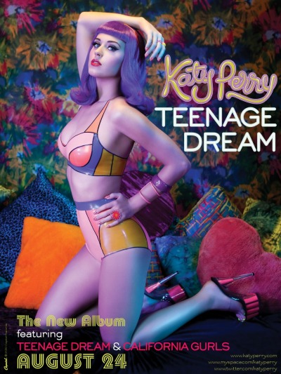
Katy Perry is a popular American singer, songwriter and actress who hasn't been in the music industry very long but is well known and liked by many. "Teenage Dream" is her second album which included a few UK number one singles. I have chosen this poster to analyse as ideas as I think it is quite unusual.
I am immediately drawn to the poster due to the use of the colours. They are very bright and bold, and are also very eyecatching. They indicate lots of emotions as they contrast and look very unusual. The way she has used produced them have been in a very creative way, almost sureal hence the title "Teenage Dream", in your dreams you can make anything possible. Katy is stood in a very sexual position and she wearing very little clothing which looked very retro themed with the use of neon oranges yellow and blues together. The way she is stood with her hand on her hip and her arm in the air shows that she is a confident person and she is showing of her curves and body. As the album is called "Teenage dream" she is immediately appealing to teenage girls and girls will see her as a unique icon and would want this perfect figure, and also idolise her as a role model which they can be like.
Katy is also wearing very vibrant red lipstick which symbolises what a typical female would wear however the way the poster has been created and also thought out with the blue wig she is wearing indicates her individul style which could reflect her style of music which again would make people want to purchase the album and listen to her songs. From looking at the photograph I think she is in a bedroom on a bed full of cushions and the wall paper is again very retro. The oranges and yellows indicate happiness and the sun where as the colour blue indicates calmess and a relaxed feel. She also has a pink heart cushion which is a typical female related colour. She is basically saying if you dream anything can come true almost as if she has been dreaming all her life to be the person she can now be and be accepted.
The writing on the right hand side which says "Katy Perry, Teenage dream" is quite big and spread out so that you can read it very clearly. She has also got links to her website which I think are very good because although they are small in the right corner people will see them and have a look at her website and get to know more about Katy and her music. I think that putting the website link would be a really good idea for our magazine advert. At the bottom of the page it says when the album id being released, this is in a very retro thought which again links in with the theme. Overall I like Katy's style of magazine advert as she has used her very own creative input and has made it very appealing and unique for her style.
No comments:
Post a Comment