Showing posts with label Analysis. Show all posts

Tuesday, 6 December 2011

Photos we didnt use

We took lots of photos which we didnt use for our cd cover for various reasons, we had lots of ideas but some of the photos which we took, didnt work as well as we had had thought.

We took this photograph as Ruksana who is the girl in the video and was going to include it on part of the inside cover for the album. After taking the picture we decided not to use it as we thought the quality didn't look as good. We thought that the frame of the picture was took really badly and we didnt like the shadow which is easily seen in the background and editing it out would look quite fake. We also thought that we should just include Jason Derulo on our digpak as he is the main person who the song is about, she just starrs as his girlfriend in the video.


We took this photograph of a heart which we created by changing the lighting in the studio and creating shapes with Ruksana's hands. We decided that when looking back at the photo that we wasn't going to use it as it looks quite blurry and unprofessional. We also thought that it looked quite close up and it would have looked much better if it was taken further away.

We thought that the position of this picture of Raees would would like a really good idea for the postion for our cd cover. We did not like this picture however as we couldn't get the lighting perfect and there is a shadow over his body which has been caused by the lighting and also the microphone. We decided to have a play around with the lighting to try to get our perfect picture.

I quite liked this photograph of Ruksana and Raees as I think the position looks really good. We decided not to use it as again we thought that we should not use Ruksanna to be on the album cover or poster. I also thought that the expressions on their faces were too different, and as they are meant to be showing this happy couple madly in love but on this photograph they are quite far away from each other and Ruksana's expressions on her face look quite moody.


We thought as a group that we would decide to create a close up Raees's face as Jason Derulo for the album cover. Once we had chosen our idea we tried to get a perfect picture by playing around with the camera. I quite like this photograph but the shadow and lighting ruined it. You can only see one side of his face as the other side is covered by a shadow. This ruins the phone image completely as it doesn't look as professional and doesn't stand out.


We thought that this photograph of Raees was positioned really well on the camera. After we took the photo and looked back at it we decided we didnt like the expression on his face. We thought he looked quite sly and looked like quite a forced smile. We thought that this wouldnt be good for a cd cover as people going to by this cd might also notice this, and on the video and the song we are not trying to portray in anyway that he is being sly.


This photograph of Raees we thought was quite a good image to use maybe for the inside of the cover. When we uploaded it onto the computer we thought that the quality looked quite poor and the photo didnt look good if we stretched it it so we decided not to use it. We also thought that the images in the background spoilt it as you can tell that it has been took in someones house and we didnt want it to look like that.


We also took a photograph when we was filming of Ruksana and Raees creating a heart by using the lighting, they created a shadow with there hands. After uploading the image we thought it looked really good but instead of using it on the inside cover, we decided to use the clip that we took on the music video as we thought that it would look more effective.


We also had an idea for the inside cover of putting lots of home images together to make it look like it has been took with a polaroid. Ruksana sent me this image from her phone which I think is really good as they look happy together, but we decided not to use it. As we are advertising Jason Derulo's album and not just the one single "It Girl" It would be quite stupid to use these because Ruksana is only part of one song, and not them all and Raees is the main person.

Tuesday, 15 November 2011

It Girl - Lyric Analysis


Jason Derulo's song "It Girl" is a typical love story which is basically about him loving a girl who means so much to him, he reffers to her as meaning "much more than a grammy award" this obviously shows that she means a lot to him because grammy awards are so hard to get and earning one can seem like such a massive achievement.

Jason him self said "An 'It Girl' to me is someone who is selfless, someone who's always thinking about others before she thinks about herself. You know, my mom is a very charitable woman, so I'd want someone who is in line with that kind of thought process. I also like a girl who's polite. I feel like that's a lost art, and just saying 'please' and 'thank you' goes a very long way with me. That's just so lost these days. So, ladies, it's OK to say 'thank you.'"

In other words this girl to him is his perfect girl. He says things such as "tell the other girls, theey can hit the exit check please" almost as if no other girls matter to him anymore, because this one girl is his everything, so perfect and special for him. "Tell them other guys they can lose your number your done" is a lyric which Jason says which shows he has a massive sign of jealousy and he wants her keep this girl to himself as his "It girl" "Cause I finally found a girl of my dreams" Jason says this, almost as if he has been thinking that one day maybe this perfect girl he has pictured in his dreams would come along, now she finally has done and he doesn't want to let her go.

"Cant seem to stop you from running, running through my, through my, mind, mind" shows that all he can think about is her. This one girl he wants to make his own and he is not giving up. We can tell she makes him happy and makes his life worthwhile. "Your my greatest hit girl" Again, he is saying that she is his greatest achievement. Over all the song is a typical R&B love song and shows love and passion all the way through it.

Tuesday, 1 November 2011

Mood board - Planning for video


Once we had chosen our song, I decided to do my own research at home based on our ideas. I had a look through my magazines at home and created a mood board by cutting out images and sticking them on bright yellow paper. I have used some random ideas and some connected to do with props, setting and even shots. I have tried to show the "Love story" theme and I have cut of images of famous celebrities, Kelly Rowland and her boyfriend, and David and Victoria Beckham. They look like really happy together which I think would be great to show with in our video. The silouette images also look like a creative idea to use as it makes them stand out very boldly. I thought about different settings and took cut out pictures of autumn leaves, the snow and also the sun in the sky which looks really effective.


I have also found some different ideas of clothing and what looks fashionable for men and women at this time of year and I love the idea of the glittery dresses and high heels. I have also found some bright red lipstick which could be worn which symbolises love and passion. I have also found some props for ideas which I think will be good, this includes a pink girly vintage chair which I think if we could get hold of would look great. Also, I have ideas for the rooms which could include pink and black cushions. I have also looked deeper into props and I thought that using a mobile phone would be good especially a blackberry as it is about a young love story and blackberrys are phones which are used by many young people


I have included lots of bright colours to create quite a "happy" feel to it. I have also cut out drawn images of hearts and rings and an orange and pink pattern in the top left corner which I think would be a good style design for our magazine advert as it looks simple but effective. Over all I have tried to make this quite creative and have thought a lot about the ideas we have shared as a group and also ideas I have thought of to add to our group.

Thursday, 20 October 2011

Rihanna - Only girl in the world


From looking at the lyrics and the video I think Rihanna is talking about wanting a particular guy to love her like she's the only girl that he will ever love. I also think that she is refering to them sleeping together and she makes sexual comments towards him about this such as, "hold me like a pillow, make me feel right" From looking at the video wich is set outside in LA we can see that Rihanna is a very powerful strong person as she shows know sign of sadness or fear about being alone, almost as if she is trying to show him that she's his perfect girl.

In an interview with, Rihanna explained the filming of the video and the video's simplistic theme, "It's really, really beautifully shot in these crazy, crazy, crazy places, We shot landscapes that we found a couple hours outside of L.A. It looks so unreal. It looks fake, like something out of a postcard with the beautiful hills… We had a lot of sunshine those couple of days, so it really worked with the whole essence of the video. But really, the video just shows this big landscape and the only person there is me" I think she has tried to make her video very girly and appealing to her, to show the guy what she really has to offer. The whole video is very saturated and full of colour. It opens up with her stood in the field which looks at first like she is wearing pearly white clothing, I think that she is reffering to herself the way she is stood as some sort of angel with high importance and extreamly powerful however, her hair is fiery red which although it could mean love it is also a sign of danger, fear and devil like. It gives me the impression that she is trying to portray this perfect image but yet is still showing him her bad side. When I look closer at her the clothes she is wearing have actually been tinted these colours and the way they move in the wind look like a strong flame.

The whole theme of the video is closely linked with the style of her album cover "LOUD" which again is showing by the title that she is not this sweet quiet person. There are quite a lot of long shots of her, the colour is quite saturated into yellows and oranges which is the colours of happiness but also the colour of fire. She has various clothes changes, she changes near the start of the video to quite a skimpy white top with a flowery skirt, the skirt however I think think looks quite childlike. She is smiling and looks quite happy. It looks to me like she has created her idea of perfection, basically saying that if he was with her everything would be so perfect. The way she dances and stands next to the flowery bushes looks she she is trying to tease him. She is also pictured in some extreme close up shots which I think are aimed to get her image out so that people can see, she also looks very fashionable.

The song is quite a fast paced song and the way she moves she is again showing her power. When she is stood alone in the field we see all the flowers blow quite violently around her, almost as is she has great powers, she also talks to the camera with quiet a fiesty angry look which looks like she is quite mean and maybe controlling. Overall I like her video as I think it is very creative and well thought out, and is very appealing to her as an individual

Wednesday, 19 October 2011

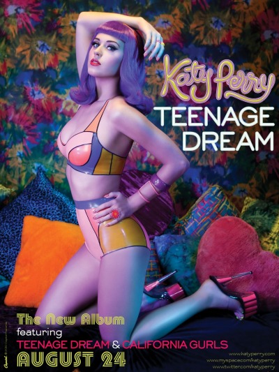
Magazine Advert - Katy Perry - Teenage Dream


Katy Perry is a popular American singer, songwriter and actress who hasn't been in the music industry very long but is well known and liked by many. "Teenage Dream" is her second album which included a few UK number one singles. I have chosen this poster to analyse as ideas as I think it is quite unusual.

I am immediately drawn to the poster due to the use of the colours. They are very bright and bold, and are also very eyecatching. They indicate lots of emotions as they contrast and look very unusual. The way she has used produced them have been in a very creative way, almost sureal hence the title "Teenage Dream", in your dreams you can make anything possible. Katy is stood in a very sexual position and she wearing very little clothing which looked very retro themed with the use of neon oranges yellow and blues together. The way she is stood with her hand on her hip and her arm in the air shows that she is a confident person and she is showing of her curves and body. As the album is called "Teenage dream" she is immediately appealing to teenage girls and girls will see her as a unique icon and would want this perfect figure, and also idolise her as a role model which they can be like.

Katy is also wearing very vibrant red lipstick which symbolises what a typical female would wear however the way the poster has been created and also thought out with the blue wig she is wearing indicates her individul style which could reflect her style of music which again would make people want to purchase the album and listen to her songs. From looking at the photograph I think she is in a bedroom on a bed full of cushions and the wall paper is again very retro. The oranges and yellows indicate happiness and the sun where as the colour blue indicates calmess and a relaxed feel. She also has a pink heart cushion which is a typical female related colour. She is basically saying if you dream anything can come true almost as if she has been dreaming all her life to be the person she can now be and be accepted.

The writing on the right hand side which says "Katy Perry, Teenage dream" is quite big and spread out so that you can read it very clearly. She has also got links to her website which I think are very good because although they are small in the right corner people will see them and have a look at her website and get to know more about Katy and her music. I think that putting the website link would be a really good idea for our magazine advert. At the bottom of the page it says when the album id being released, this is in a very retro thought which again links in with the theme. Overall I like Katy's style of magazine advert as she has used her very own creative input and has made it very appealing and unique for her style.

Tuesday, 18 October 2011

Magazine Advert - Jessie J - Who you are


Jessie J is a British artist/songwriter who has a typical style of r&b. She has not been in the limelight very long and is still a very new face to the music industry. Jessie J's album "Who you are" was released in February 2011 and charted at number two on the UK Albums Chart.

I found this advert for her album in a fashion magazine for women. First impressions of the advert I can see that there is little colour but yet the black which has been used is still very eyecatching. As we know that Jessie is a very new artist we know that she wants to get her image out too get the public to like her. The photograph is a very close up photograph of her face and we can only see up to her shoulders. She dominates the whole page as it is very clear and close up. The colours which have been used on the whole advert are monocrome, black and white. The advert is quite simple but well thought out.

Jessie looks very mean and aggressive and doesn't really look approachable, not the typical image of a female. The writing at the bottom of the advert advertising her songs are black on white which makes them stand out very boldly, they are also in capital letters which shows the high importance to reading them. As we can see, one of her songs are called "nobodys perfect", well by looking at her we get a totally different image for the way she is presented, her hair looks very neat and perfect as well as her black lipstick which has been neatly painted on. Also the song "Do it like a dude" links in with the way she looks, very angry, fiesty and quite boyish.

The colour black has also been used but can also make you question about what more she has to offer and what she is really like. It can also indicate class and sufistication however, it can also symbolise death and a gothic image. Jessie herself is not giving nothing away as she is leaving people to question her emotions and think about her true colours, what she is really like. The writing "Jessie J" covers most of the page which shows that she is trying to make people aware that that is her name, and people should remember it.

Although it is quite a simple advert I think it works really well at portraying this myserious image of her true character.

Poster Ed Sheeran

Image and video hosting by TinyPic
Ed Sheeran is a recent artist who has just came into the music industry. His album '+' is a highly antcipatied album becoming number one. One of the ways used to promote his album is through posters. I frequently purchase the music magazine Q, a highly respected music magazine and this is where I found this poster.

The poster features a picture of the artist Ed Sheeran with a close up of his face. The artist is looking down smiling which reflects on his personality. The smile suggests to me that he is proud of the success of the album. The colour of the poster has a reddish brownish hue highlighting the ginger hair of the artist, what he is most commonly reconginised for.

There is little writing on the poster which demonstrates the simple nature of Ed Sheerans music, it informs the reader of some of the songs which are included 'A team' and 'Lego House' which are big hits, this might make the audience want to buy the album more. There is also a quote, 'what really sets Sheeran apart is his skill at painting pictures with posters', this gives a positive input to the artist and suggests that his music is as beautiful as a painting. The positive review of the album is also reinforced by the four stars at the bottom of the poster suggesting it is very good.

Overall, I think this is a very effective poster and we will use similar ideas in our own album poster.

Monday, 17 October 2011

Magazine Advert: 'Lady Gaga - Born this way'

Born this way is Lady Gaga's latest album released in summer 2011. It was highly anticipated so the 'haus of Gaga' (her production team) had to think of ideas to promote the album. One of the most effective ways they promoted the album was though promotional posters. The one shown was the one mainly used to promote Born this way.

It features a close up of Lady Gaga (the artist) that fills the whole poster. There is a red sketchy title that says 'GAGA' which indicated the artist. As the album was so highly anticipated there wasn't any need for a name because everyone knew about the album.

The poster also uses religious connotations to indicate the release date of the album. This suggests her music is also going to reflect a religious nature too.

I don't think we can just use the artists name on our poster because the album isn't as well know as Born this way. However, some features used like the large scale image and reflecting the music style in the image of the poster could be used on our poster.

Album cover research: 'Rihanna - Talk that talk'


Looking at Rihanna's new album "Talk that talk" it is giving off a completely different image to her previous album cover "Loud". The album was released on November 18, 2011 and talks about love, sexuality and empowerment. From looking at it compared to her previous one I think it looks very different, this automatically shows that she is trying to tell us that she . The cover is still of a close up photograph but ive off a very different feel to itinstead her eyes are directly making contact, they are very dark and look quite gothic. From looking at her face her eyebrows are faced up, she looks quite fiesty and arogant, I also think that she looks quite evil, I think this also makes you question what she has to offer, what kind of music is on the album? Is it quite fiesty and powerful? It is aimed to draw you in so that you want to listen to it.

From looking at her clothing she is wearing a camoflage top. We usually associate camoflage clothing with being related to the army, the army are very powerful and the clothing is also worn to make them hidden from the enemy, this makes me think that Rihanna is hiding what she has to offer, that she is not revealing anything about the CD, this again would make people want to buy it because they would really want to see what she is all about, how good the album is. From looking at her face I personaly think that she is trying to portray this individual unique image, that she is like nobody else, this links in with the name of the album "Talk that talk" which we can see is tattooed on the arm, almost as if she wants people to know who she is and she wants to get people talking about her, to create word of mouth so that everyone knows who she is. The writing is also in capital letters and is quite boldly written on her arm. This is quite a daring thing to do which shows that she is not afraid of doing anything which could reflect on the album, she is not afraid of coming out and doing her own thing.

From looking a Rihanna's lips like her old album cover look perfectly painted which shows her pefection however, her hair is delibrately messy and is a natural brown colour unlike the fiery red on her old album cover. This shows that she has two sides that she might possibly we showing her true colours and her natural identity. The way she is licking her lips up shows that she is possibly teasing us about the album, like we wont know what its like until we listen to it. Instead of having her name on the front cover she has got a huge letter R in the top left corner. This indicates that she is already well known and all she needs really is a picture of her face as people already know her name, this again indicates her cokiness and arogant side.

Over all even though this picture appears to be quite simple, when you look at it in more detail she seems to be telling us quite alot and is trying to persuade us to buy her new album in various ways.


This is a photograph of the cd cover of her album. I think this is really creative as it links in completely well with the album name "Talk that talk". This image is of a newpaper which has been spread out onto the disk which appears to me that by producing her new cd that she is trying to get everyone talking about her to again create word of mouth. The colour of the CD has been used with natural colours just like a newspaper which makes it look very natural. I think the way this has been made is really creative as it has been made to look like the article is about her and her songs in a very unusual way. I really like this idea as when you normally look at CD covers they look quite plain and boring but this has had some thought put in to it.


From looking at Rihanna's back cover we can see a photograph of her full body rather then just her face. She is still giving us eye contact drawing attention. The photograph is in black and white and she is stood in quite a run down building. Rihanna's clothing looks very creative but yet shabby, almost as if it has been created like a "mishmash" nothing fitting together. Rihanna herself looks very sexual, the way she is stood and is posing for the camera, very confident and controlling, this could also reflect the songs themselves, extreamly powerful, and also Rihanna's personality. We normally associate the colour black with smart dress and perfection, but this is the complete opposite. This indicates that her music might be somewhat creative and able to adapt her voice and personality to different situations.

I think Rihanna herself is trying to portray the image of being quite intimidating. On the photograph on the left of the back cover I can see a skull being burt on the fire, this is indicating quite possibly that we shouldnt underestimate her, the could be reflecting on her voice, and basically saying that she is capable of anything. The song titles are also down the right side of the page and are in a bold red colour which are eyecatching. The colour red in itself can have different meanings, it could stand for love passion and desire which could refect Rihanna's music, and it can also be the sign of blood, fire, and the devil. Red is a colour in itself I think is well chosen because it can have many different meanings, she is not giving away anything about the album, but she definately thinks that creating word of mouth about the album is crucial.

Overall I really like Rihanna's digipak as I think she has been very creative through pictures rather than words, and analysing it has made me think about other options which we could use into creating the best digipak.

Sunday, 16 October 2011

Album cover research: 'Beyonce - 4'


I've chosen to look at Beyonce's album '4' artwork because her music fits into a pop genre, similar to Ellie Goulding's.

The cover uses simple colour tones that go well with each other.

The artists name (Beyonce) is in capital letters which suggest she is the most important thing about the album. This is also reinforces when a large picture of the artist covers part of the name and most of the album cover. Which we could use a similar idea in our own artwork.

Beyonce's pose is very suggesting; she's looking away from the camera holding her arms in the air, suggesting she wants the audience to look at her body. She also wears revealing clothing, only a fur item over parts of her chest, this also suggests that her image is as important as her music.

The back of Beyonce's album has a similar title although it's not covered suggesting it's been striped back, for people to take it serious. This could also suggest she does want her songs, which are listed, to be taken serious.

However, she is still a main figure in the image, but she's turned away again suggesting it's mainly her music which is important.


Album cover research: 'Katy Perry - Teenage Dream'


Katy Perry, the artist, is clearly in the front, and centre album artwork. This suggests that she is the most important thing about her CD, not her music or fashion but her image. This is also conveyed by her naked image, again suggesting image and appearance is very important.

The album features a fun font suggesting although she has a serious pose she is fun, which could also reflect the type of music she sings. Or, the fun font could reflect the album title 'teenage dream', that the fun fonts and her naked would be a 'teenage dream'.

However, the minimalistic nature of the album (having only her and the title on the front) could suggest that she isn't fake and this is her and her music striped back.


The back of the album cover continues with the fun font, even through the 'serious' album information. The song titles take up most the back cover, this could suggest that music is most important to katy.

Magazine Advert - N Dubz- Greatest Hits


N-Dubz are are British hip hop group which are from Camden in London. They include three different people, Dappy (left) Tulisa (middle) and Fazer (right). This album includes all of there greatest hits put into once which it its self can be very appealing to those who love N Dubz.

Firstly from looking at the picture, we can see that there isn't much going on, but they are each trying to portray completely different images. All three of them look very unique and are dressed and presented in their own individual way, this could indicate and reflect on the music as they are trying to portray that there music is different and they do not follow the typical croud to everyone else. On this picture they are all stood tall and you can see their bodies, they are not giving anythijng away with there emotions, almost as if they are leaving us guessing about what they are about to reveal.

All three of there faces are clearly in show, and although they are a well known group in the music industry they still want to keep up there popularity and stay known and loved. The advert has a colour theme running through it which consists of muted blue colours, black and white. Although the colour black is not very eyecatching, the fact that the writing at the bottom of the page is white on the black background it makes the writing which is very important stand out clearly. We normally associate the colour blue as more appealing to boys however, the female in the group Tulisa is stood right in the middle of both Dappy and Fazer. Tulisa is wearing a pale blue dress which looks very girly. I think she is trying to say that just because there are two boys in the group and only one girl, that it is still appealing to both males and females.

Tulisa practically dominates the page. She is stood tall and looks very confident with her hands on her hips like she has no fear what so ever, this could also refect on the album to show that they are very daring people and they are not afraid to try new things and push themselves achieve the best songs and also public likeablity. The blue lights behind them I think look really good as it is shaped like a star, which could indicate that they are own stars in their eyes and they are very proud of what they have done. The writing at the bottom of the page which tells us when the song is out and also the song it includes, is in white bold and also in capital letters to indicate the importance. It is also quite big, clear and in show aimed so that it catches peoples eyes when flicking through the magazine.

Over all I really like the design for this advert and I also like the colour choice which I think might be a good idea for our magazine advert.

Album cover research: 'Rihanna - Loud'


Looking at Rihanna's album cover "LOUD" we can tell that she is being quite secretive and is not revealing much to us,probably to get people to buy the album to see what she really has to offer. From looking at the picture we can tell although much isn't going on, it was been well thought out. Rihanna herself has got her eyes closed and we can see her long dark black eyelashes which stand out perfectly however, the title "LOUD" has no impact on the way Rihanna looks, she looks the total opposite, quiet and peaceful however I still think she looks quite false as if she is putting on this relaxed "perfect" image. Rihanna herself looks very immaculate. Her hair is in contrast with her lips, a fiesty red colour which is giving off a "sexy" image. The colour red is usually associated with love and passion which makes us think a lot deeper about what Rihanna's cd is really like. Although her rosy red lips are painted so presicely and bold along with her hair and makeup the photograph of her is so close up you can only see her face and the top of her shoulder. Again, this shows she is not giving anything away but the shy person cannot be true as someone so shy would not be able to take an extreme close up photograph of her face which dominates the album cover, this indicates she has a lot more to offer. We can tell that she wants to get her image out so she is known and recognised by many.


From looking at the back cover of this album we can tell that she still has no interaction or is giving us no eye contact whatsoever. There isn't much colour in this picture, the bold vibrant red colour has changed to a very pale which indicates her soft but still very girly side. The album looks very clearly that it is appealing to females. Instead of the extreme close up photograph of Rihanna's face we can see her whole body. She is sat far back and looks very weak and vunerable and is a typical image for a young female but she still looks quite angelic and perfect. She is still giving me the impression that she is hiding away her "true colours" as the baby pink tint covers her body and face making the true colours hidden. The necklace she is wearing in the picture is also extreamly large which again is being used to cover her up, she has done this in a very stylish way and still looks like an icon for young females. The songs which are written on the right of the cover are written in dark red capital letters boldly emphasising the importance of them. They are also very eye catching. I think Rihanna has chosen her style for this CD cover really well as it is simple but effective.


I also decided to look at the design chosen for the disk to this album. Again the girly theme is still connected as it is a design of pale pink rose petals which makes it look very abstract and floral. I love this design as it's quite simple and not over the top which makes it look really effective. I think this sort of design would look great for our cd cover.

Friday, 14 October 2011

Album cover research: 'Florence and the Machine - Lungs'


I believe the album cover for Florence and the Machine’s Lungs album is very interesting and quirky, reflecting upon the individual nature of Ellie Goulding.

The most captivating image from the album cover is the lungs on the lead singers body, this highlights the name of the album and also gives connotations that she is a very powerful singer with large lungs. To a certain extent, the album cover is almost very graphic and may repulsive many people, however I believe the individuality of the artist will appeal to an alternative audience.

Florence, the lead singer, takes up most of the album cover stressing her importance, she is also looking away from the camera with her head turned suggesting that she is either slightly shy or deeply absorbed in her music.

There are flowers in the background and the colours of the album are neutral giving the album a nature and authentic feel, this is a idea which we could convey into our own album cover, we decided to film our music video in woods and parks to give the idea of an authentic and natural feel and we can reflect upon this idea in our album cover.

Monday, 3 October 2011

'One Republic - Secrets' Music video analysis


One Republic’s music video fits into the pop/rock music genre. This music video is illustrative because the camera frequently shows close ups of the band and also has a narrative which relates to the lyrics and beat of the music. There are several close ups of the bands instruments such as the guitar and drums which is a typical convention of the rock genre. The video shows a woman waiting in a cafe and also walking around a city reflecting the ideas of secrets and that she is anxious waiting for somebody.

The music video does fit into the typical rock/pop music video conventions, it appears to be a big budget music video because it shows a city looking very similar to New York and the city is empty except for the actress which suggests that it must of cost a lot of money to empty the streets of a city.

The lighting of the video is set in the day, the dull lighting and the clothing of the characters implies that the video was filmed in autumn. The clothes on the woman are neutral colours reflecting on the simple mood of the music video and the big coat she wears shows to the audience that the video is set in autumn time. Also, the video shows the band members behind a white sheet showing the shadows of the band members.

The mise-en-scene of the video is based in a upper class part of a city and also shows the band performing in what appears to be a concert hall reflecting on the authenticity of the song. There are several symbolisms in the video such as the bird flying emphasizing on the lyrics of giving secrets away.

Overall, I find this video enjoyable to watch. The camera is constantly either cutting to the band or to the woman, making the narrative of this music video interesting.

Sunday, 2 October 2011

'Rihanna - Unfaithful' Music video analysis

As research into choosing our song and ideas for our music video we looked at Rihanna’s song “Unfaithful” which is an R&B/pop song. The video has been portrayed as being within in the “Illustration” category as it is a simple narrative video which re creates the song to help give you a good idea of what’s going on. The song is about a young girl who is in a relationship but is having an affair with someone else which is a realistic “love” story and also typical of this type of genre.


Rihanna refers to herself in the lyrics as being like a “murder” the dark moody image has been portrayed throughout this video through the use of dark dull lighting and filters. The song is also quite slow paced with a playing of a piano, this links in very well with the sadness moody feel to the video. At the start of the video we see Rihanna in very extreme close up shots of sections of her body to promote herself, and also show us the long black dress she is wearing which makes her look like a very intelligent sophisticated woman. There are also some low angle shots. She also looks perfectly done up with her makeup hair etc which gives me the impression that she takes a lot of pride in herself however, whilst this is showing we heart a heart beat in the background which shows she may be possibly scared or panicking. She looks in the mirror at herself and we then have jump cuts and cut aways to a scene where she is sat with a man in a restaurant. We see the close in close ups and long shots. We then get a few past paced jump cuts to different scenes in which she is with the same man however she is wearing different clothing which is typical of a R&B/pop genre. I think the fast paced jump cut technique looks really effective and I think it would look good to use in our music video.


At no point in the video does Rihanna show signs of natural happy expressions, her face looks very sad and nervous and the smiles she pulls almost look false and forced out. We also get a feel that a hand held camera has been used at times to give a “shaken” effect which could symbolise her relationship as if it is on the rocks.
The whole video carries on quite dark with the black curtains etc which has been deliberately put there to create more impact within the video. There are also some shots of Rihanna which fade out to black which I think look really effective. There have also been some long shots of her lying across a piano which shows her very weak and vulnerable side not like the “sophisticated” image we portrayed of her before. Looking at the rest of the video we see Rihanna in a different clothes change, which is typical for the genre and also would be a good idea to use in our music video. We see her wearing white clothing which symbolises innocence and purity which is very ironic as this is not the case as we can tell from the narrative of the story or suggests she is feeling some form of guilt. She is also pictured wearing red clothing which also symbolises love and passion which again has been deliberately chosen as a “false” image.


The young black man in the video is not portrayed in the way that black males are portrayed in a stereotypical R&B music video. Instead of wearing “hoodies” and gold chains etc he is wearing very different clothing, quite basic and also looks like he takes a lot of pride in himself.

Looking at “Goodwins Analysis” there is a massive relationship between lyrics and visuals as Rihanna acts out the song with in the video so we get a clear image of what is being portrayed. There are also a lot of close ups of her face to promote herself so that the artist can develop motifs and there are no intertextual references to films, tv programmes and other music videos.


Over all Rihanna’s video is a very typical video for this genre. Although I like watching the video and also the genre of the song we decided not to use this for are music video as we thought using this typical love pop song narrative would be too much alike to we are deciding on something a lot different.

Tuesday, 27 September 2011

'Ed Sheeran - A Team' Music video analysis


The video fits into the Acoustic/Pop genre. The video doesn’t have typical pop genre conventions, for example, it doesn’t show the singer playing live or close-ups of the singer, in fact, the artist doesn’t even appear in the video.

The video fits into the illustration category because even though the artist doesn’t feature in the video, the lyrics support the narrative in the visuals.

The camera is handheld and shaking throughout the video. This gives the video a more personal feel, making the video feel low budget even though it’s a mainstream pop/acoustic video. This personal feel is also very untypical of a pop music video because they are normally big budget with huge camera movement, for example jib or crane camera angles.

The editing of Ed Sheeran’s video is very minimalistic. The video doesn’t have any blatant transitions, again, untypical of pop videos.

We can’t tell that any special effects are used apart from a black and white filter added to the video. The black and white effect adds an amateur feel to the video unlike typical pop music videos.

The Mise en scene in the video is simple. The locations are in public, for example, the park, the street. Other locations in the videos include in buildings and rooms. In the narrative the character is a prostitute (we assume) the clothes she’s wearing match this typical style (leather and ripped clothes).

The light in the video tends to be dark and hard to see, it’s also harder to tell what lighting is used by the black and white effect used.